Layout components include the Container component and
Tab component. Click "Components" in the left sidebar, select
the components you want to add under the "Layout" category,
and drag it to the right dashboard:
Container component
The Container component can combine multiple components.
When the Container component is moved and the size is changed, all the
components in the Container component will be moved, proportionally scaled,
and the relative layout is stable. When using a Container component, you
only need to drag and drop a component into the Container component. A
Container component contain the following configuration items:
- Border: the style of the container border
- Background: the background setting of the container
component
- Color: the background color of the component
- Gradient: Whether to enable the gradient effect,
you can also choose the direction of the gradient effect when it's
enabled. The gradient color is related to the background color of
the component
- Background Image: The background image of the
component, you can directly select the built-in images of MapDashboard
as the background or add a custom background image. To add a custom
background image, you need to fill in the picture address and upload
a picture. And you can set the picture repeating effect too.
- FullScreen button: Wether to enable the full-screen
button.
- Size: The size of the container component,
in pixels
Tab component
A Tab component divides the panel into multiple states,
you can add components to each state separately; by switching tabs, components
in different states of the same panel can be displayed.
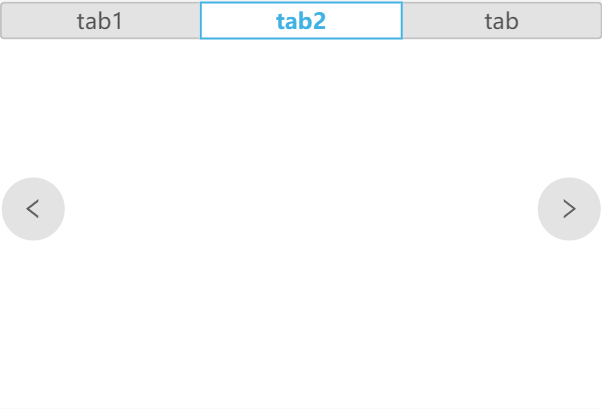
Specific operation: Click a tab name to switch the
Tab component to a different state, and then drag components to the corresponding
state of the tab component.
The configuration items of a Tab component are as follows:
- Tab Page: Click the Add button to add a new
tab; for the added tab, you can rename, remove, etc.
- Switch: By default, you can click to switch
tabs. You can also turn on the sliding switch, that is, swipe in the
tab content area to switch to another tab.
- Slide: Whether to support sliding to switch
the current tab
- Slide Button: Whether to display the switch
button, you can switch the current tab through the switch button
- Size: the size of the slide button
- Font Size: the size of the slide symbol in
the slide button
- Font Color: the color of the slide symbol in
the switch button
- Slide Button Background: the background color
of the slide button
- Background: the background settings of the
Tab component
- Color: the background color of the component
- Gradient: Whether to enable the gradient effect,
you can also choose the direction of the gradient effect when it's
enabled. The gradient color is related to the background color of
the component
- Background Image: The background image of the
component, you can directly select the built-in images of MapDashboard
as the background or add a custom background image. To add a custom
background image, you need to fill in the picture address and upload
a picture. And you can set the picture repeating effect too.
- Size: The size of the Tab component, in pixels